Monday, April 13, 2009
cd research
Wednesday, April 8, 2009
Jonathan Hoefler
Monday, April 6, 2009
movie poster research

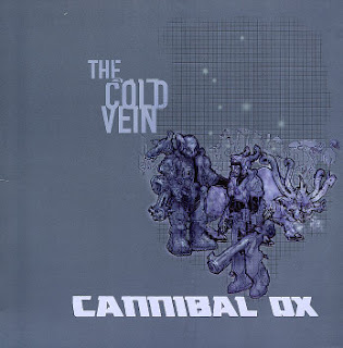
Not only is this my favorite hip hop album of all time, it is also one of my favorite album covers. The sci fi art and monochromatic color scheme matches perfectly with the music on the album.
The Akira movie poster features the coolest bike ever.
Wednesday, April 1, 2009
Neville Brody
Sunday, March 29, 2009
more Saul Bass
Wednesday, March 25, 2009
Sunday, March 22, 2009
Jean Carlu
Jean Carlu's work was influenced by the geometric shapes of Cubism and he achieved a streamlined economy of form. Carlu spent the years of World War II in the United States where he designed posters for the war effort. I would agree that his designs and compositions are effecient. I find the Gift Packages For Hitler! poster to be very clean indeed.

Jean Carlu, Give'em Both Barrels, date unavailable, Art Deco
Jean Carlu, Larrañaga Havana Cigars, date unavailable, Art Deco.

Jean Carlu, Gift Packages for Hitler!, 1942, Art Deco
Wednesday, March 18, 2009
Michael Bierut
Sunday, March 15, 2009
Max Ernst

Tuesday, March 10, 2009
James Montgomery Flagg

Flagg, a master of pen and ink, sold his first illustration at the age of twelve and worked for the magazines Life and Judge at the age of 15. Altough he is best known for wartime posters that include Uncle Sam, I prefer his comic illustrations like this one.
Monday, March 2, 2009
mascots
 Sonic the Hedgehog is Sega's Answer to Nintendo's success with Mario. Sonic as a mascot is one of the key reasons for the company's success during the 16-bit era of video game consoles. Sonic is one of the most recognizable video game characters in the world. Not only has he been a successful mascot for Sega, but he has also appeared in animation and comics. Compared to an Italian plumber, Sonic is an edgy and rebellious character which, in my opinion, sums up what Sega was as a company in the early 90s.
 The Frito Bandito was the mascot for Fritos corn chips from 1967 to 1971. He was dropped as a mascot because some found him to be racially offensive. Racist or not, any character animated by Tex Avery and voiced by Mel Blanc is cool in my book. Frito Bandito is cartoony and tells me that i would have fun eating Fritos.
 Created by Chris Rutt after seeing a black-faced performer at a vaudeville show, the image of Aunt Jemima began appearing on thousands of pancake mix boxes in the 1890s. During the 1950s, the image was criticized as being a negative portrayal of African American women and the trademark has been gradually modernized since then. Nevertheless, her warm smiling face suggests that she can cook up some bangin' pancakes.
Sunday, February 22, 2009
Herbert Macnair
Sunday, February 15, 2009
Alphonse Mucha
Alphonse Mucha, JOB, 1897, art nouveau.
Mucha began earning widespread attention in the 1890s for his illustration work which included posters of Sarah Bernhardt, and he became one of the most prominent artists of the Art Nouveau movement. I really admire how he handled the smoke and hair in this poster.


